Graphic design is very important in the digital industry, as it creates brand awareness and is crucial in advertising. This is especially important when fans visit the Facebook page of their favorite brand, restaurant, or bar and the first thing they see is their cover photo. Check out my tips for creating an eye-catching Facebook cover photo!
However, before most users reach their Facebook page, they see their advertisements on their news feeds. These advertisements are important to campaigns because they have to be compelling and relevant. They are composed by a concise caption with a clear call-to-action and an image that grabs the user from the endless scrolling on their News Feed.
There are many different types of Facebook Ads for a business to consider. Some posts should be for engagement on a page, while others should be more promotional or just advertising your business and what it offers. For every type of image that is posted, read the following tips to make your campaign’s images a success.
#1 Understand Your Target Audience
When it comes to advertising, understanding your target audience is important so that your message is relevant. The same concept applies to the type of images that are used. Age, gender, ethnicity, and interests are all factors that come into play when you’re making images that your audience can relate to. I’ll use our client Clear Gear as an example. This ad is effective because it is using an image targeted toward people who like yoga.

#2 Use Powerful Images
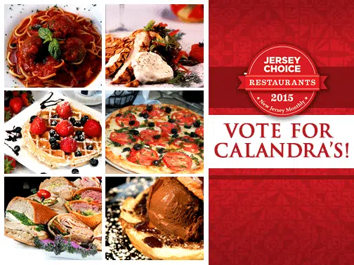
The first thing people are going to see when scrolling down their News Feed is the image you use in your ad. Most of the time if someone reads the copy in your caption, it is because the image caught the user’s attention. When choosing images for these Ads, hi-resolution images work best, especially since Facebook will scale them down. These images should be about the type of service, or message you are trying to convey to your audience. You shouldn’t rely on copy alone to get your message across. For example, for our client Calandra’s Bakery and Restaurants, we use great photos of their dishes in their campaign to encourage their fans to vote for them in the New Jersey Monthly Magazine’s Jersey Choice Restaurant Poll.
#3 Obey Facebook’s 20% Rule & Test Ad Photos
Facebook is enforcing the use of text within imagery in News Feed Ads, by limiting it to 20%. You can find the specific rule from the Facebook Advertising Guidelines (III. Ad Creative and Positioning, D. Images). Facebook uses a grid on each image and in this grid 5 boxes equals 20%. This means that all copy, including logos with logotype has to reside within five boxes of a grid. You can upload any image and see how much copy you have here. A useful tip that I have learned myself from designing these Ads is to design using the grid. To do this, upload a white .png file and take a screenshot of the grid. Then you can place this layer into your Adobe Photoshop file, lower the opacity and design around the boxes. This will save you so much time! For example, for our client Ahava Medispa in Livingston, NJ we used the space around the image of the woman effectively to include their logo, their service’s logo, and their promotion.

Thanks for reading! You are well on your way to creating the best Facebook Ad. Have any questions or comments? Please be sure to share them below!