At some point or another, even non-graphic designers need to design something. When the time comes to make crucial design decisions, most people don’t really know what they’re doing, so they rely on what looks good to them. Fortunately enough for you non-designers out there, we’ve put together the 5 most important design concepts for you to use as a cheat sheet!
-
FONTS
When first beginning a project to design, we suggest putting all your text and any images you want to use, in your workspace. When choosing which font to use, limit how many. No matter how big the project, you shouldn’t ever use more than 3 fonts! A font for your header, any sub headings and a simpler font for body text is all you need, we promise.
Any header fonts should be eye-catching and draw the viewer’s focus there first. You can do this by increasing the size of the text, making it bold, or making it a different color that matches your design. However, do not, I repeat DO NOT, EVER, use a script font in all caps. If you must use a script font, use it sparingly and in sentence case. Avoid using decorative fonts for your body text; it makes it very hard to read. For body text, stick with a serif or sans serif (EX. Times New Roman, or Arial) or something that is branded for the project you’re working with. You can find free fonts to use for your designs at www.Dafont.com, and https://www.fontsquirrel.com/.

-
HIERARCHY OF ELEMENTS
The arrangement of certain elements is very crucial in a design. This is where you have the power to direct your viewers to look in certain places first. If you have a header, subheader or some sort of call-to-action and then body text, then organize it in that exact order. The header or most appealing visual element should be on top to draw the viewer in and get their attention. A great hierarchy in your design will get the audience’s attention so that the viewer will be interested in the rest of the content. So when in doubt, if you squint your eyes and you can still recognize the hierarchy without being able to read the text, you’ve designed successfully!
-
COLORS
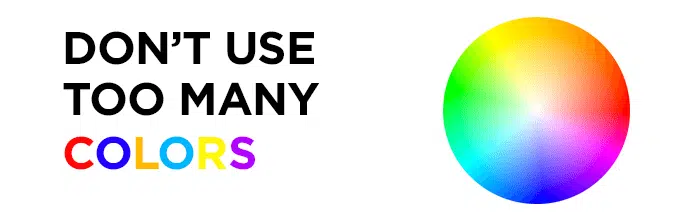
Adding colors – or lack thereof – to a design can be the defining feature of a good or bad design. It can help distinguish a hierarchy of titles, or separate them by using shapes and/or background colors. However, too many colors can make the piece of work confusing and an eyesore, while no color can make it bland and boring. Limit yourself to three complimentary colors. When using color, keep the text in mind and make headers different colors. Or, use a different color background than the body text. This will help the text stand out, and help direct the viewer’s eye to more important parts of the design.

-
WHITE SPACE
Negative space is your friend! Even though you have a ton of space, it does not mean you should use every pixel! A good amount of whitespace can help the viewer focus on one thing at a time. Filling up most of the space will create tension and make it hard for a person to focus on one single thing in the design. The negative space is much more important than most non-designers would think because it provides legibility and sense of tidiness which helps deliver a clearer message to the viewer. However, if your eye keeps moving to an area, and it seem’s empty, then you should probably put something there.
-
 TYPOGRAPHY (AKA: TEXT)
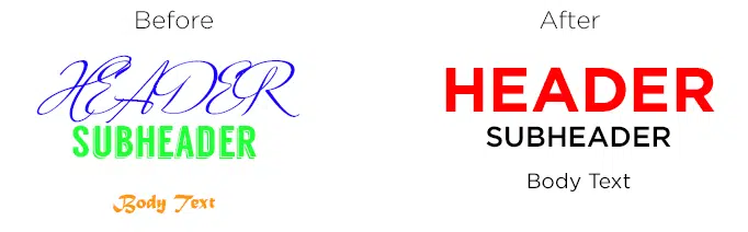
Other than how many fonts to use and which styles of type work best, there are many other tips that can help a non-designer. The way the type is presented can either make or break the project. As seen in the email blast on the left, the “miss!” and “tissue!” are alone on the line leaving a lot of awkward space on either side of them. This is known as a “widow” and is a big NO-NO when dealing with text. Instead, organize the text like the email blast on the right so that there is no awkward space and the content looks organized. The edges of the text in the email blast are almost even, but making the paragraph margins uneven and irregular looking is another rule that one should be take into consideration.


BEFORE AFTER
Another thing is to never ever EVER break one word into two different lines by hyphenating it. Instead, just bring the entire word to the next line if it doesn’t fit on the first line.
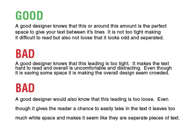
BONUS TIP: Keep in the mind the space between lines known as “leading.” If the editing software allows you to control the leading, be sure not to make it too tight or too loose. The following image gives you more of a visual representation of how leading works!
If you’re a beginner, and want to get your feet wet with graphic design, be sure to learn How to Design and Keep Your Sanity for your future designing help!